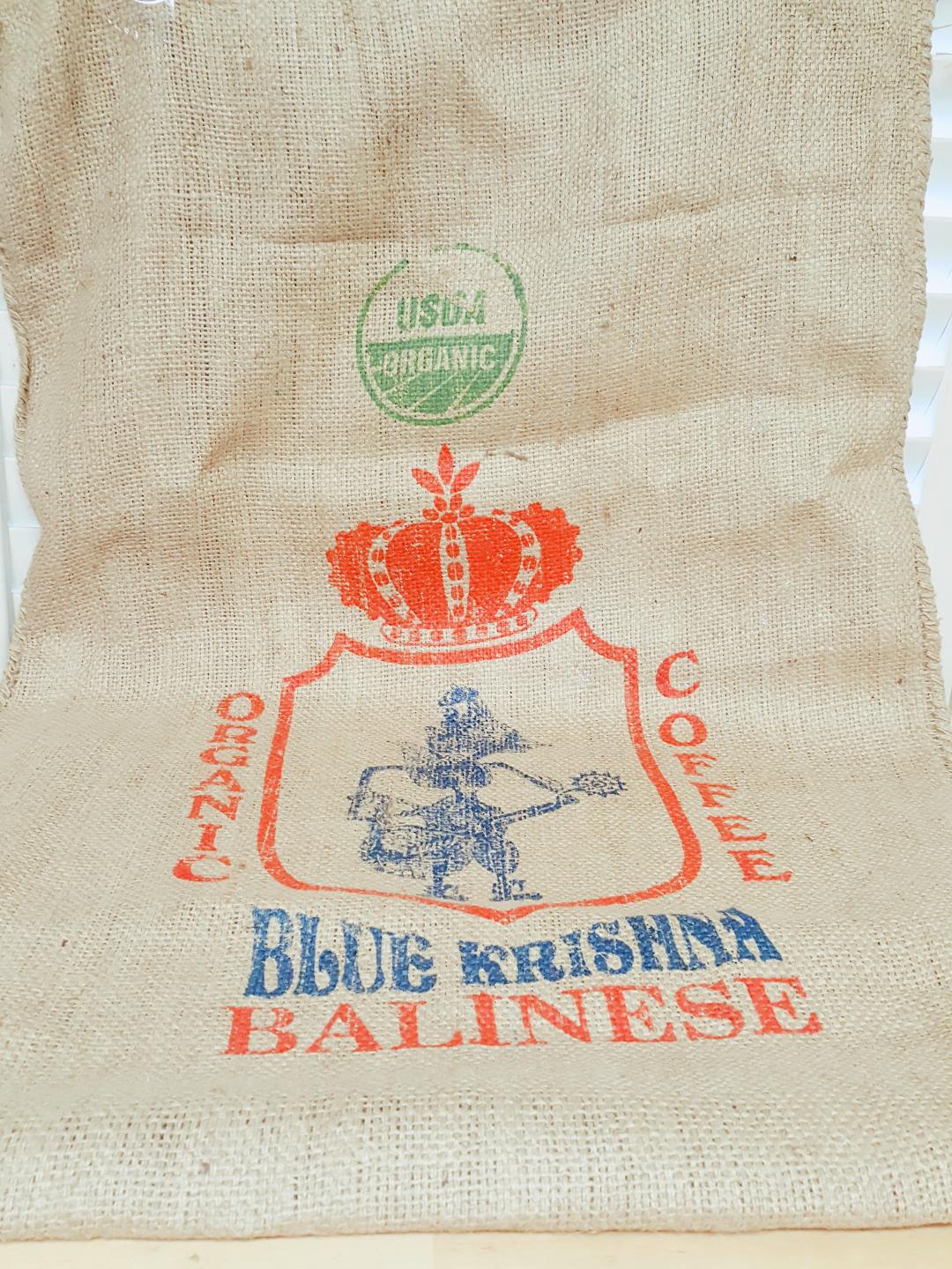
One of the struggles that many makers have is taking a good photo of their product. Disclaimer here: I have no idea what constitutes a good product photo. Yes, I've read the tutorials, tried different ideas and have seen loads of gorgeous photos from many artists. I have also seen shops that have total crap pictures and scads of sales. My mind says that good pics = sales but my heart is still on the fence about it. I recently posted a picture of a new background that I was trying out. I acquired a fantastic, funky organic coffee shipping bag.
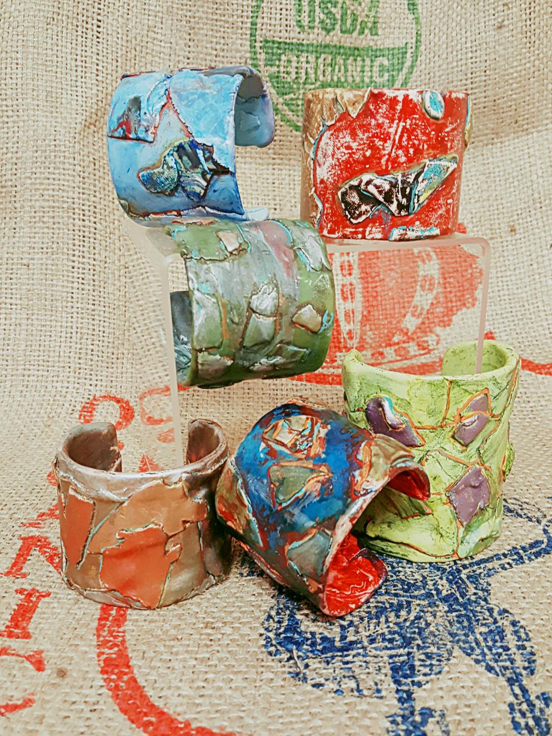
It is made of a coarse burlap with a cool design on the front. I thought this would make a good backdrop for my Urban Grunge bracelets (coffee, hip, urban, organic -my mind wanders). So I did a shot with it and posted it. I got a lot of good feedback though one of my besties said I should stick to white and send her the burlap! The next picture is of my bracelets on the burlap background.
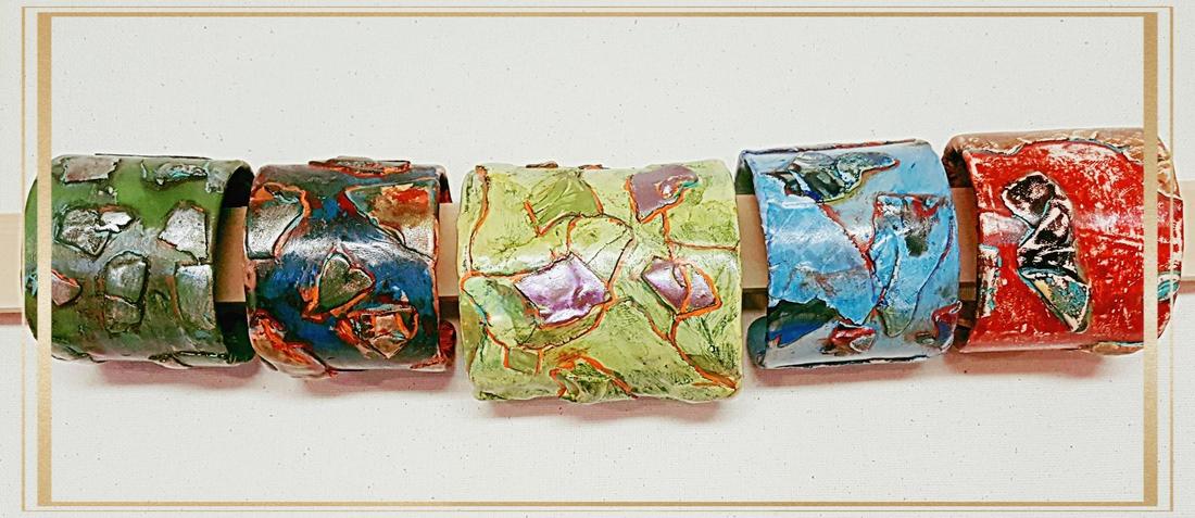
I do like it but I feel it is distracting from the funky nature of the cuffs. Having read in the past that white pictures are easier to see and not distracting that is what I have been using in the past. I started adding a gold border, not sure why, I just like it. So this is what the same bracelets look like in that format.
I think my friend is right; I should stick to the plain, white backgrounds. Looks like she will be getting some burlap in the mail soon!


 RSS Feed
